Visual identity
In addition to the name change we announced in April 2025, we also developed a new visual identity. Our goal was to create a design that is clean yet dynamic, simple yet bold. Whether it’s a perfectly lit still life, a spontaneously captured cinematic moment, or a tailored visual identity, we bring focus, curiosity, and craftsmanship to everything we do. We focus on working with intention — cutting through the noise with visuals that are clear, considered, and built to last. To us, the new name and identity represent just that. Stated Agency: Visions made visual. Boldly stated.
Logo wordmark
Logo Icon
Colour palette
Typography
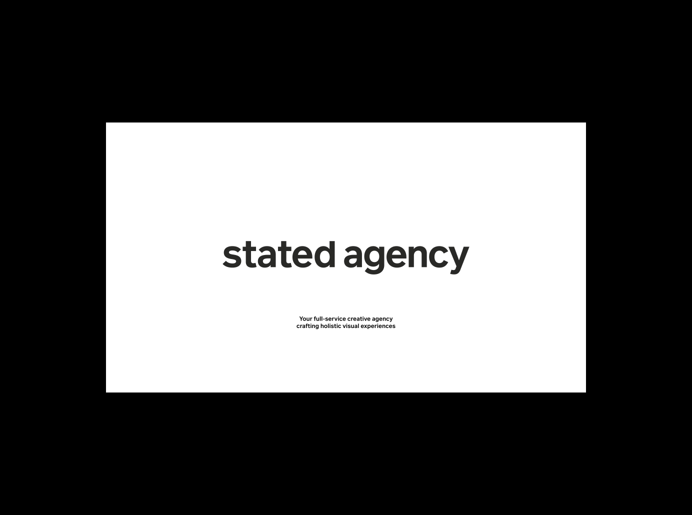
Presentation template
Website design
Examples of identity in use (mockups)
Logo wordmark


Typography

The typography FF Infra is designed by Gabriel Richter.
Presentation template
Mia Flarup
Mia Flarup
Art Direction:
Graphic Design:


Logo icon


Colour palette


Examples of identity in use


Website design

